

Brand Guidelines
Purpose
The Open Secure AI Alliance is a community of organizations building and sharing an open defensive stack of AI models, tools, and techniques to strengthen cyber defense and secure AI agents. Its core purpose is to provide defenders with capabilities they can inspect, adapt, trust, and control, while fostering collective defense and shared learning from AI incidents.
Brand Attributes
- Neutral Governance: By operating under the Linux Foundation, the alliance provides a vendor-neutral home to contribute and build shared tools, models, and techniques without control by any single company
- Collective Security: The alliance facilitates testing systems together, sharing evidence, and converting those discoveries into robust, ecosystem-wide protections
- Systemic Resilience: Defenses are designed to be portable, ensuring they remain effective even as underlying models, vendors, and infrastructure change
- Evidence-Based Learning: Through the Shared AI Findings Exchange (SAFE), the alliance confidentially analyzes AI incidents and near misses to turn recurring failures into actionable, shared controls that reduce systemic risk
Logo
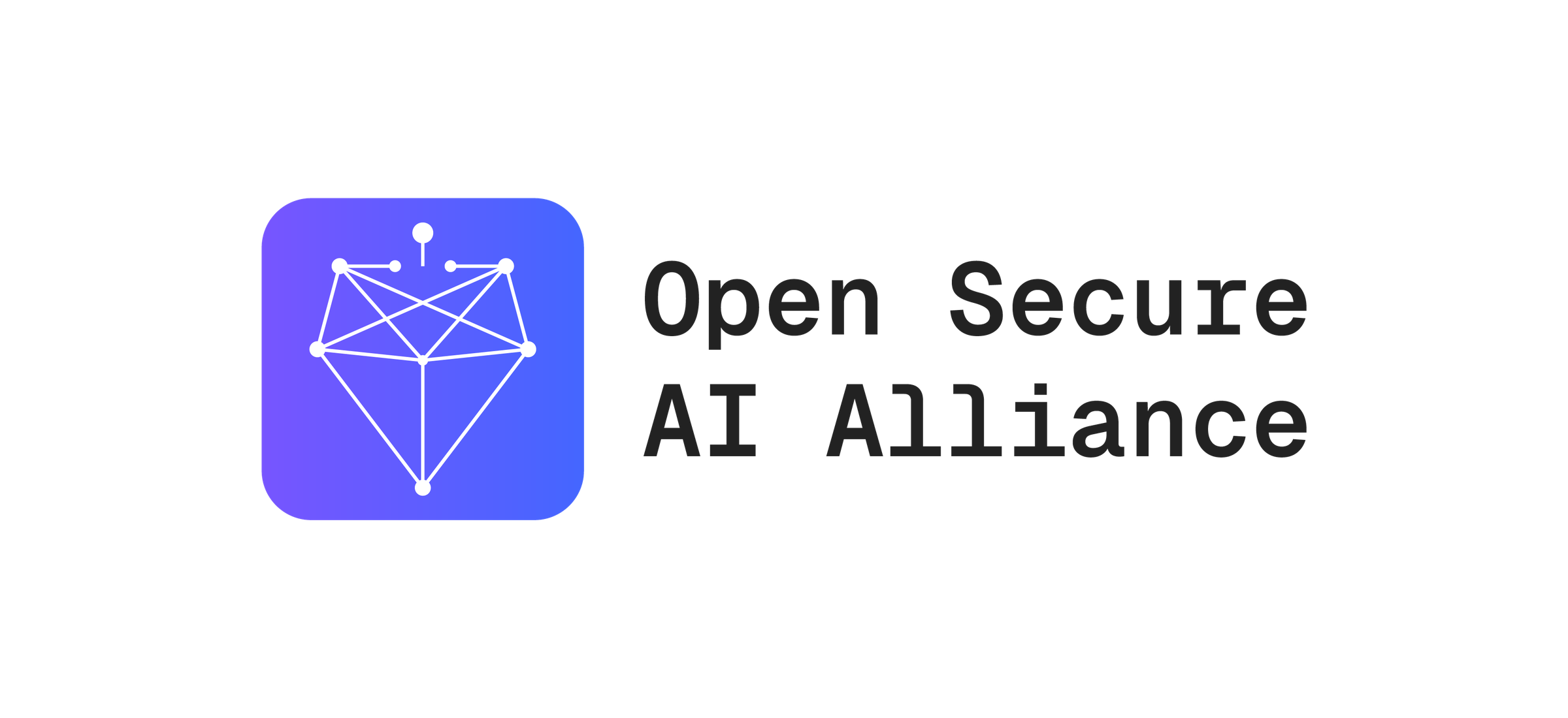
Our logo is composed of two core elements: the symbol and the logotype. They combine in a fixed relationship to form our primary logo. This is the most complete and recognizable expression of our identity, and should be used as an introduction to the brand.
When in doubt, default to this primary logo.
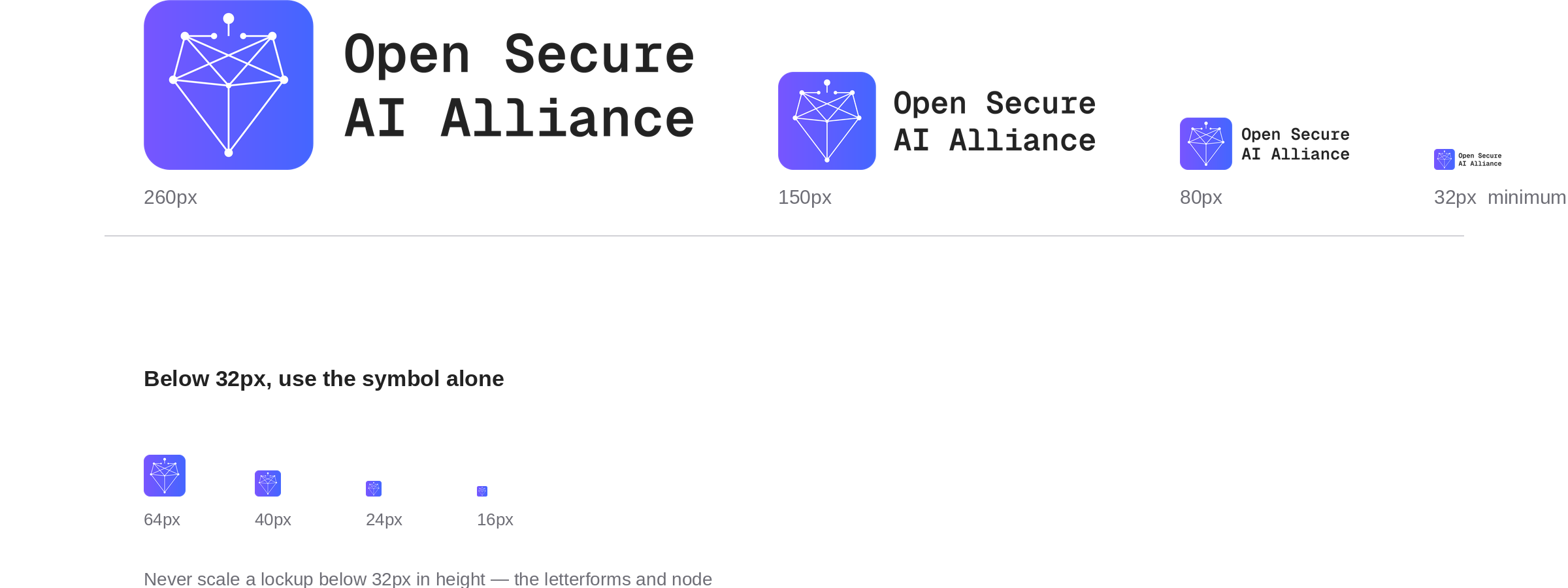
Logo Scaling
The OSAIA logo lockups should never appear smaller than 32 pixels in height. This minimum size preserves legibility and ensures the integrity of the lockup. When space is limited, use just the symbol instead, which is designed for clear recognition at smaller scales.
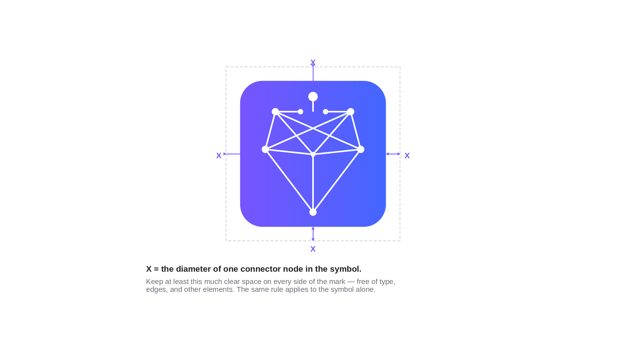
Clearspace
Our logo needs breathing room to maintain its impact and clarity. Maintain a minimum distance defined by continuing the grid an additional layer. Apply this equal spacing around all sides to preserve integrity across every application and ensure the logo never feels crowded. This applies to the symbol as well as logo lockups.
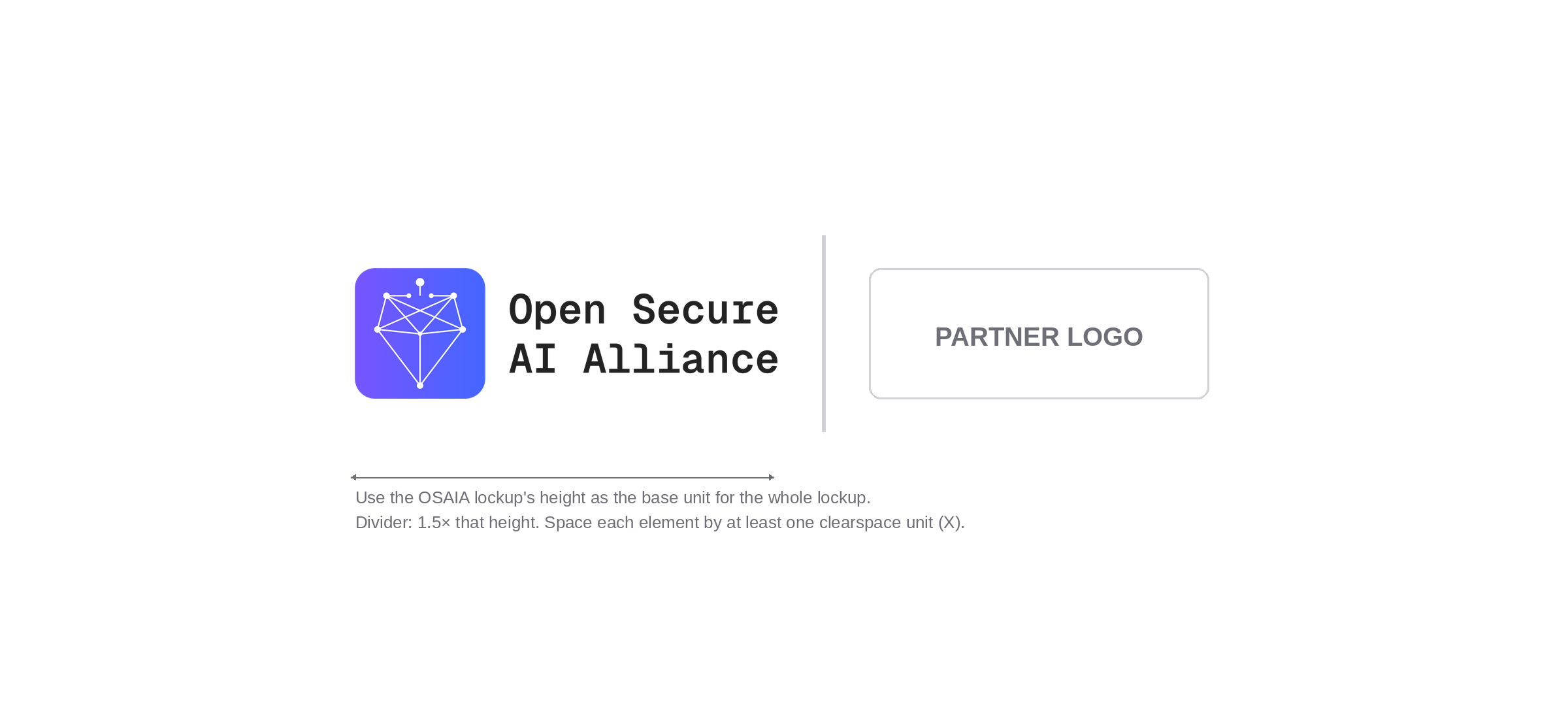
Partnership Lockups
For simple partnership lockups, we pair our logo with a partner’s logomark, symbol, or icon. Use our logo’s height as the foundation for all measurements, separating elements with a vertical bar that’s 1.5x the symbol’s height. Create breathing room by maintaining the minimum clearspace between each element to ensure both brands feel equally present and respected.
Watchouts
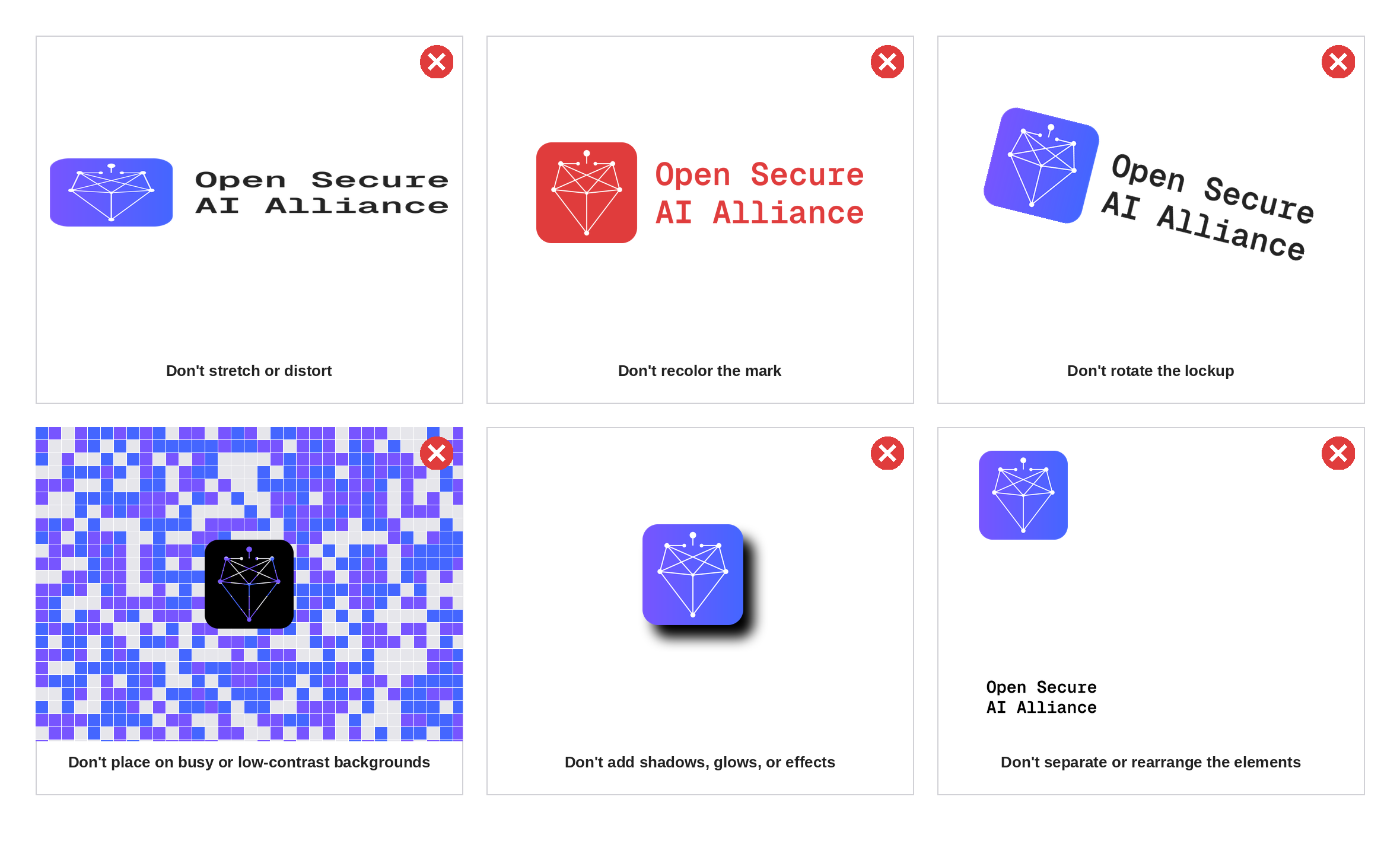
To preserve the integrity and effectiveness of our brand, it’s crucial to use the our logo consistently and as intended. The following examples illustrate common misuses to avoid.
Symbol
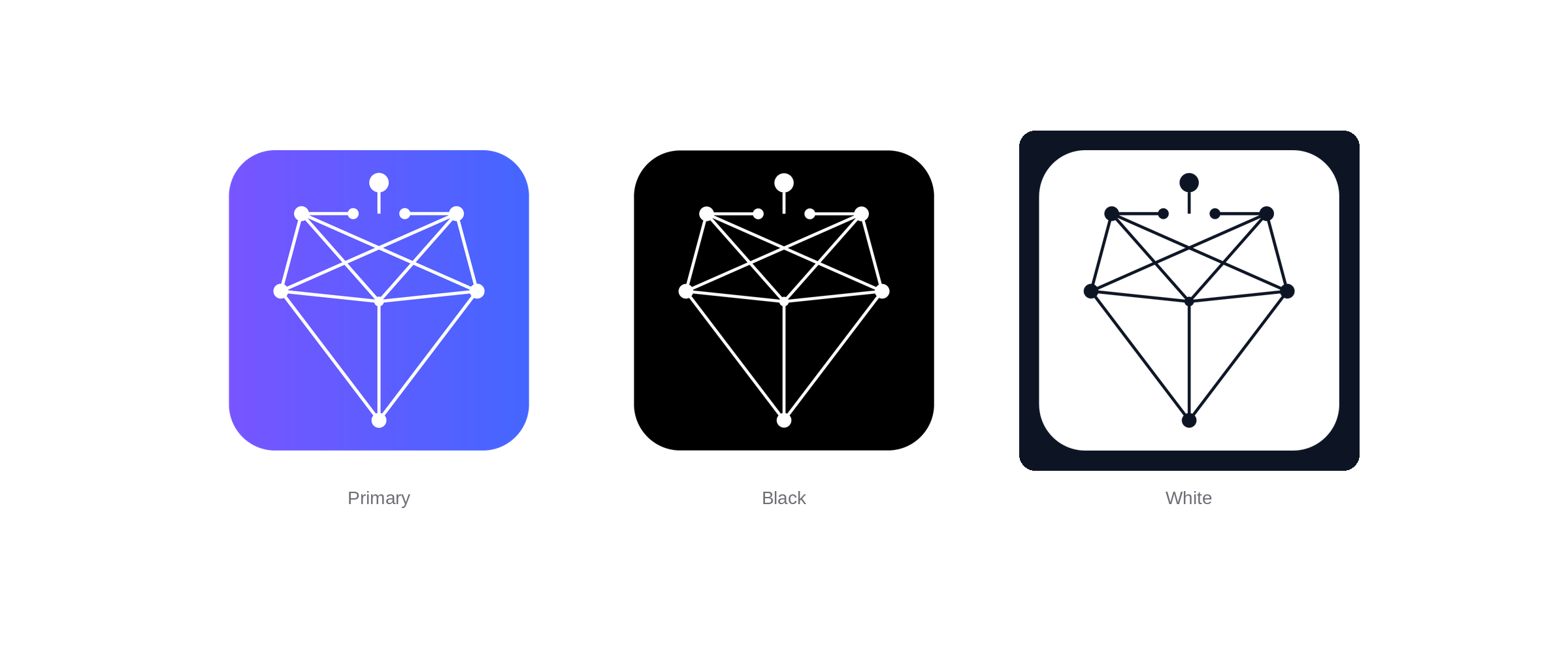
Our symbol is made of squares and circles that visualize structure, stable governance, and shared principles.
The symbol may be used independently as a shorthand for the brand in contexts where including a full lockup is not practical, such as social media avatars, app icons, or small-scale applications. It may also appear on select swag items where a more graphic, standalone mark creates greater impact.
Primary Palette
Our visual foundation rests on black and white. Together, they create a high-contrast visual language that’s both striking and functional, ensuring optimal readability and a clean, professional aesthetic. This restrained palette allows our logo to stand out with greater impact.
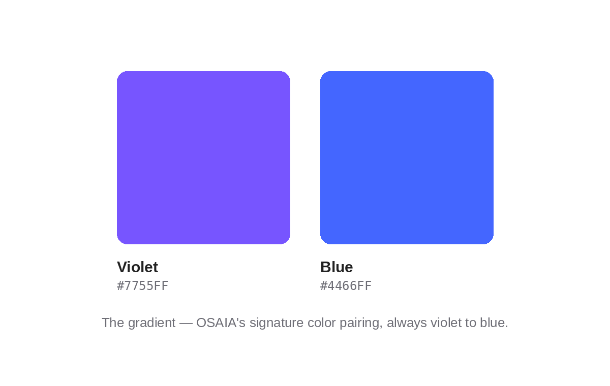
OSAIA Purple
- HEX #7755ff
- CMYK 68 70 0 0
- RGB 119 85 255
- Pantone 2665 C
OSAIA Blue
- HEX #4466ff
- CMYK 76 63 0 0
- RGB 68 102 255
- Pantone 2727 C
Secondary Palette
Our visual foundation is supported by a secondary palette of coral and lilac. Together, these tones introduce warmth and softness, creating a balanced visual language that feels both inviting and distinctive. This complementary palette enhances the overall aesthetic while providing subtle contrast, allowing our logo to remain the focal point.
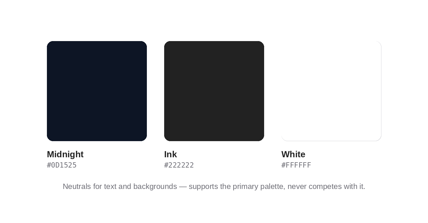
Midnight
- HEX #0D1525
- RGB 13 21 37
- CMYK 88 78 55 71
- PANTONE 5395 C
Ink
- HEX #222222
- RGB 34 34 34
- CMYK 72 66 64 72
- PANTONE Neutral Black C
White
- HEX #ffffff
- RGB 255 255 255
- CMYK 0 0 0 0
- PANTONE Bright White
Typography
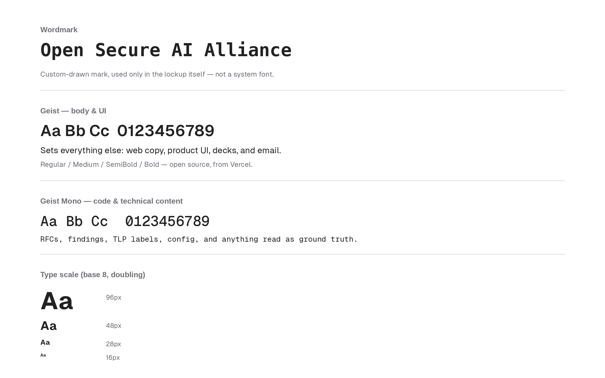
Our typographic system pairs Geist and Geist Mono. Geist carries everything people read — web copy, product UI, decks, email — with a clean, engineered feel that matches how we build. Geist Mono takes over wherever precision matters: RFCs, findings, configuration, TLP-style labels, anything meant to be read as ground truth rather than persuasion. Both are open source.
Our typographic scale is derived from doubling the root numbers 8, 16, 32, 64, and 128, generating a comprehensive scale for nuanced sizing.
Iconography
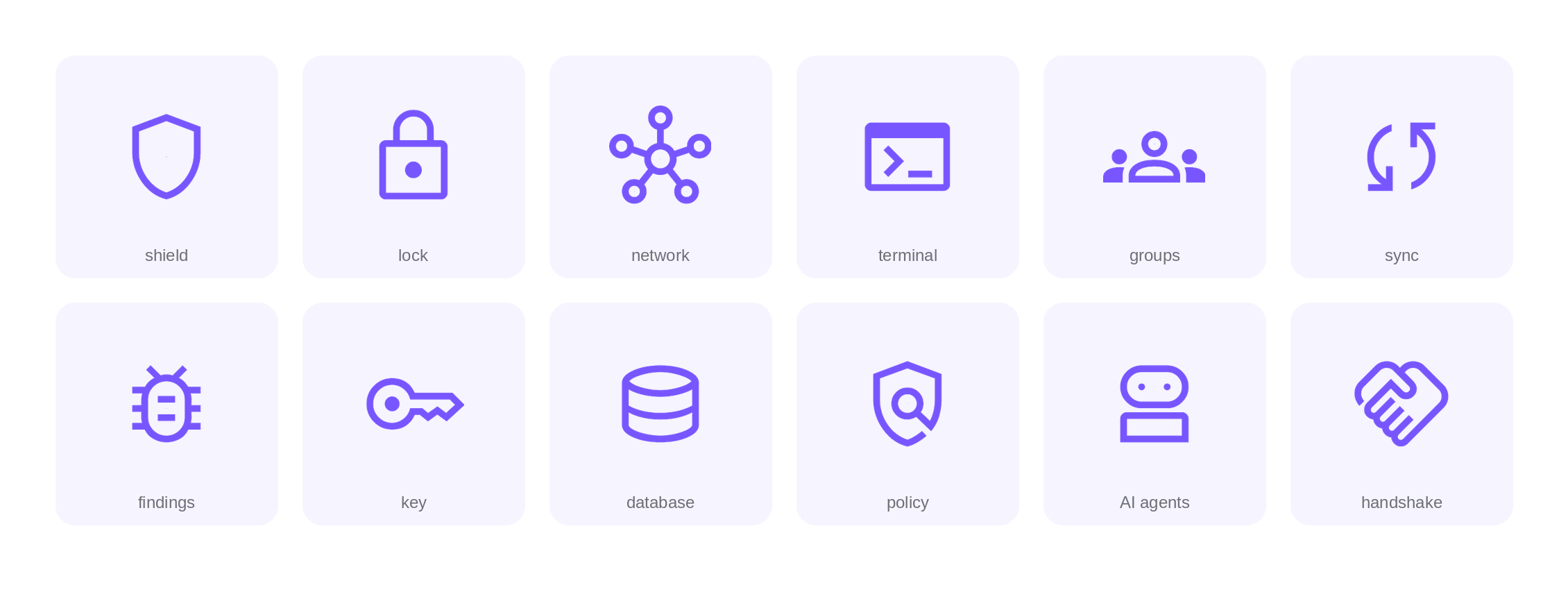
Google Material Symbols are used as the brand’s core iconography system. Their simple, contemporary forms provide a clear and consistent visual language across digital and print applications. Icons should be used consistently in style, weight and scale to complement the brand without overpowering other visual element
Legal
By using Open Secure AI Alliance brand materials you agree to the Linux Foundation Terms of Use, the Trademark Usage Guidelines, these Open Secure AI Alliance branding guidelines, and all Open Secure AI Alliance rules and policies as may be updated from time to time. You also acknowledge that Open Secure AI Alliance is the sole owner of Open Secure AI Alliance trademarks, promise not to interfere with Open Secure AI Alliance’s rights in them, and acknowledge that goodwill derived from their use accrues only to Open Secure AI Alliance. Open Secure AI Alliance may review use of the branding materials at any time and reserves the right to terminate or modify any use.
In general
For those using Open Secure AI Alliance brand materials on a site external to Open Secure AI Alliance , please don’t use our name, logos, or screenshots (“brand materials”) in ways that may be confusing, misleading, or suggest our sponsorship, endorsement, or affiliation. For example, your name and logo should be more prominent than the Agentic AI Foundation name or logo. And please don’t edit or change the Open Secure AI Alliance logo — we like it how it is!
Advertising, promotional, and sales materials
Please check in with us before using our logo on websites, products, packaging, manuals, or for other commercial or product use. It’s ok to say in text “Member of the Agentic AI Foundation” or “Open Secure AI Alliance Member” (as long as it’s true!)
Education and instruction (books, guides, publications, and conferences)
You can use our brand materials for educational and instructional purposes but please remember that it shouldn’t be confusing, misleading, or suggest our sponsorship. For example, we generally don’t allow use of our logos or screenshots on book covers.
Also remember to include this statement (or something like it) in your printed materials: “[Title] is not affiliated with or otherwise sponsored by Open Secure AI Alliance.”
Products, websites, names, and logos
Please don’t use our name as a part of your company or service name, website name, trade name, or product name. Don’t use our logo or incorporate our logo into yours. Don’t use a domain name containing “akrites” or any confusingly similar words.
Linking to Open Secure AI Alliance
If you want to promote your organizations affiliation with Open Secure AI Alliance you can use our logo if it meets our guidelines. For example, “[Company Name] is a member of [linked logo].”
Merchandise
While we do produce lots of t-shirts for our events that have our logo on them, we don’t generally allow third parties to make, sell, or give away anything with our name or logo on it.
Attribution
Please include appropriate attribution of Open Secure AI Alliance’s ownership of its trademarks when you use them. This attribution notice can be included in the fine print at the bottom of your content. An example is, “Open Secure AI Alliance and the Open Secure AI Alliance logo design are registered trademarks of the Linux Foundation.”
More questions?
Feel free to email questions to marketing@secureaialliance.org. It helps if you send a mockup of your intended use so we can be specific in our response. We’ll do our best to get back to you ASAP but please give us two weeks (please note that no response doesn’t mean approval.) We’re currently only able to respond to inquiries made in English.